Logo
variations
01
The Beaming Dental logo comes in three variations — horizontal, vertical and the isolated symbol — each in Beaming Blue for light backgrounds and white for Beaming Blue backgrounds. Use the horizontal logo by default; use the vertical logo when space is more square, and the symbol on its own where the full name is already present or space is tight.
Logo variations — Horizontal


Logo variations — Vertical


Logo variations — Isolated symbol


Logo
guidelines
02
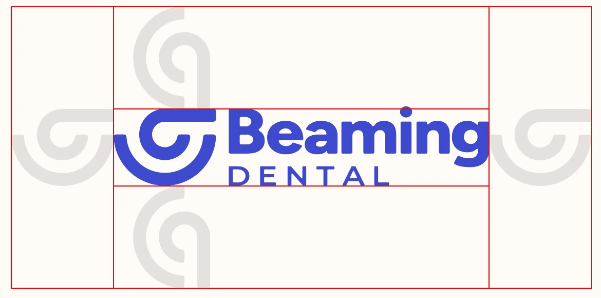
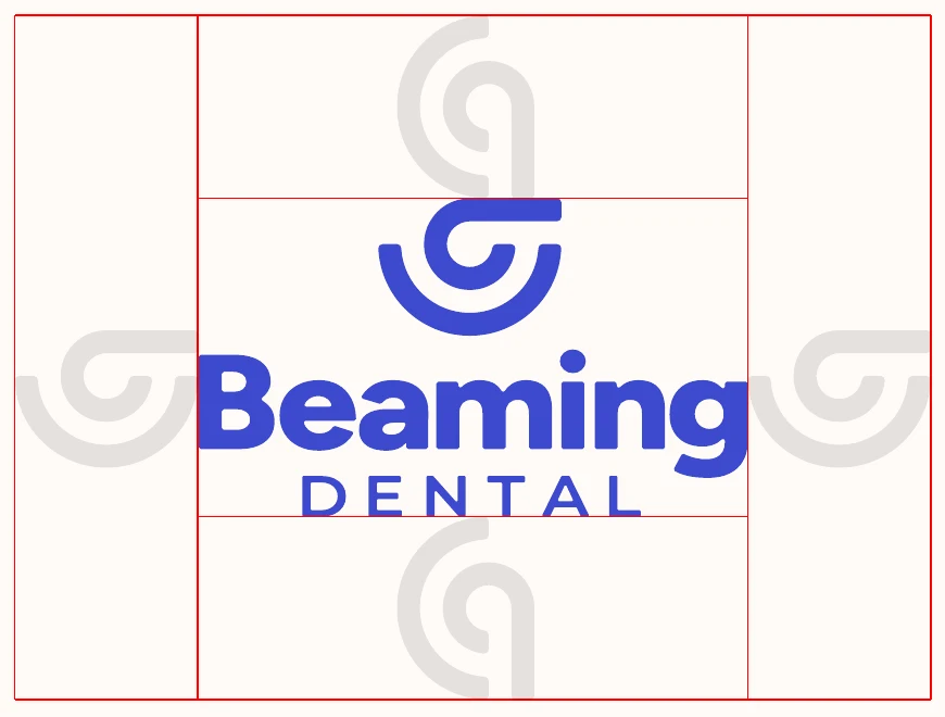
Logo guidelines — Safe zone
Give the logo room to breathe
The logo safe zone is a guideline to help ensure that the logo does not get encroached upon by other elements in a layout such as graphics, text, sponsors, etc.
Use the width of the symbol portion of the logo as a reference for the size of the safe zone. No other elements should fall within this area.
Logo guidelines — What to avoid
Never alter the logo
Always use the supplied logo files as they are. The examples below show common mistakes to avoid.





Typography
03Typography — Font
The brand font is Figtree
Typically the bold weight should be used for headlines, the light weight should be used for subheadlines and the regular weight should be used for body copy. Depending on the layout, there might be exceptions to these rules, but they are a good initial guideline to keep communication clear and consistent throughout the brand.
Figtree is a free Google font.
Download fontAa Bb Cc Dd Ee Ff Gg Hh Ii Jj Kk Ll Mm Nn Oo Pp Qq Rr Ss Tt Uu Vv Ww Xx Yy Zz 0123456789
Typography — Type hierarchy
A simple, proportional system
Text size will vary depending on the usage and layout, but referencing this system helps to keep things balanced and ensure that branded materials have a cohesive look.
Using the height of a capital letter in the body copy as our reference (1x), we can use multiples of this to determine the size of the headline, subheadline and the spacing between each element.
- Headline: 4x body cap height, with 4x space above it
- Subheadline: 2x, with 3x space below it
- Body copy: 1x
- Use sentence case for headlines and subheadlines — only the first word and proper nouns are capitalized.
Headline goes here
Subheadline goes here
Body copy goes here. Lorem ipsum dolor sit amet, consectetur adipiscing elit, sed do eiusmod tempor incididunt ut labore et dolore magna aliqua. Ut enim ad minim veniam, quis nostrud exercitation ullamco laboris.
Typography — Buttons
Four button styles
There are four button styles for the website: a primary and secondary button for use on blue backgrounds, and a primary and secondary button for use on ivory backgrounds.
The font weight should be Figtree SemiBold. The corners on all buttons should be rounded. Use sentence case for button labels, with a comfortable amount of padding on each side.
Colour
04Main palette
The main palette consists of two colours: Beaming Blue and Ivory. These two colours are the foundation of the brand colour palette and should be the main focus in the majority of assets.
Secondary palette
The secondary palette consists of four colours: Bubble Gum, Grape, Mint and Peach. These should be used sparingly and strategically as accents — to support campaigns, highlight secondary offerings, and draw attention in icons, labels and illustrations.
Click any value to copy it.
Photography
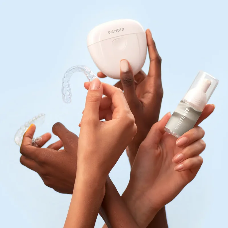
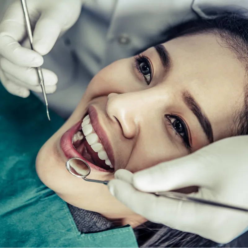
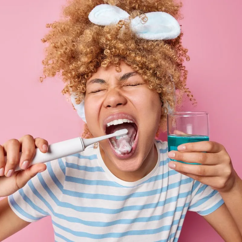
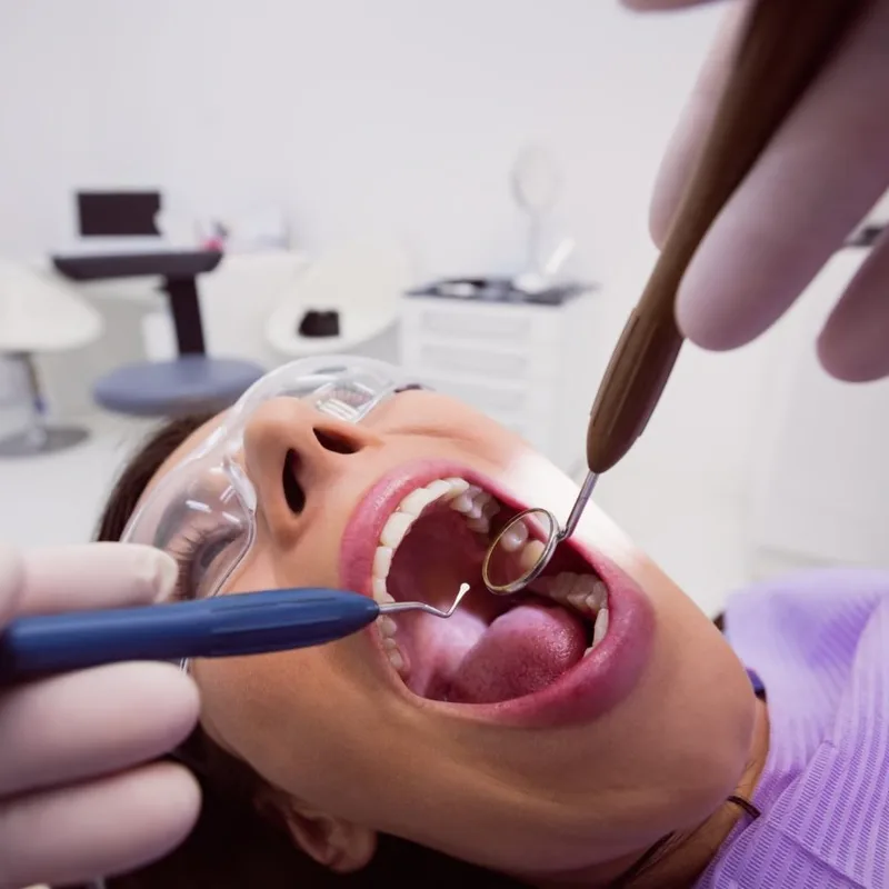
05- Are high resolution and clear
- Feel natural and have genuine expressions
- Represent diversity in age, race and gender
- Offer natural light and bright scenes
- Have neutral colours or complement the main brand colours


- Are pixelated or blurry
- Portray negative emotions or feelings
- Are overly cluttered or confusing
- Have watermarks on them
Application
examples
06
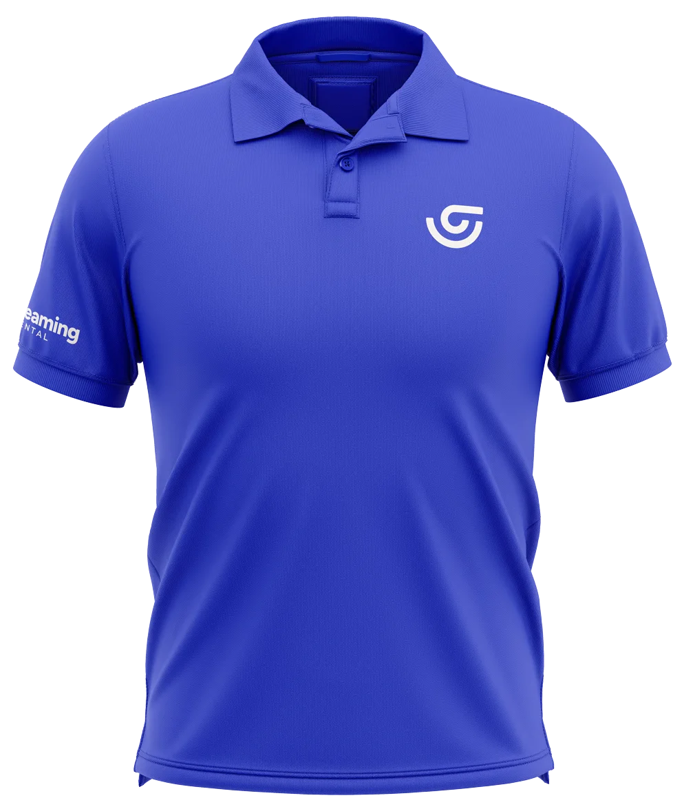
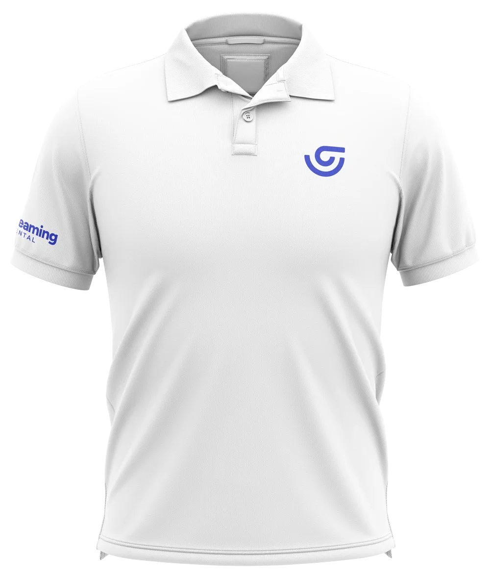
Polo shirts
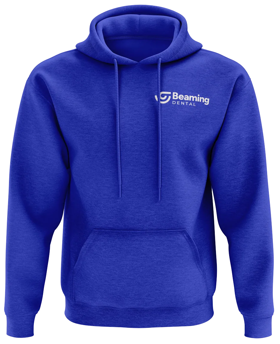
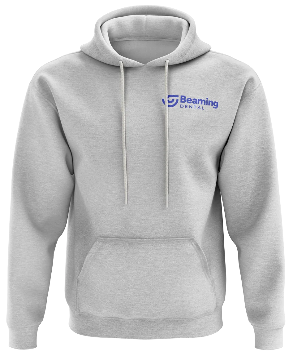
Hoodies
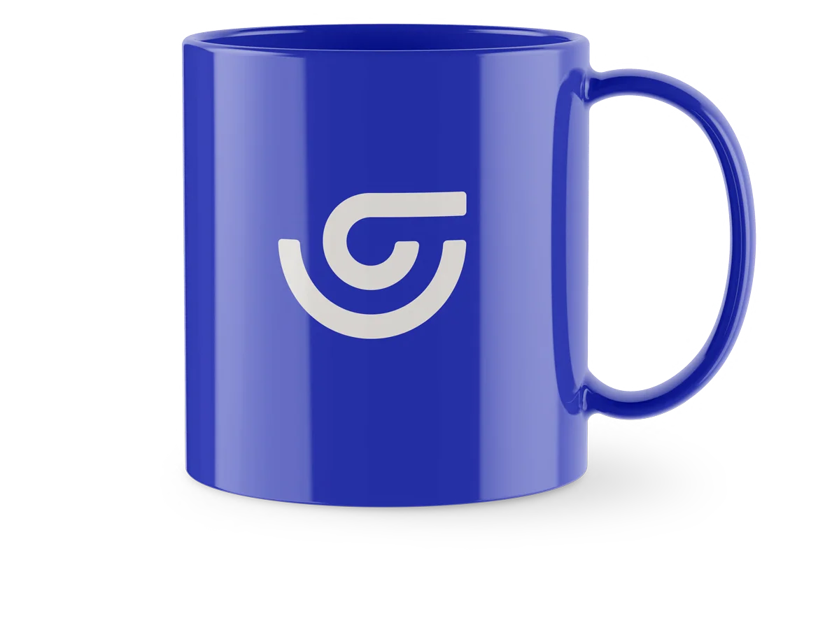
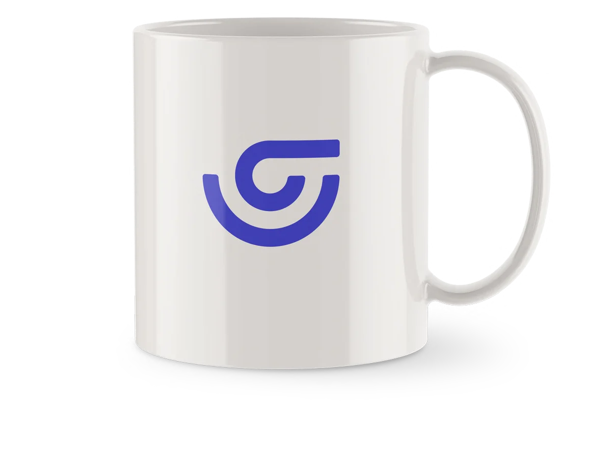
Mugs
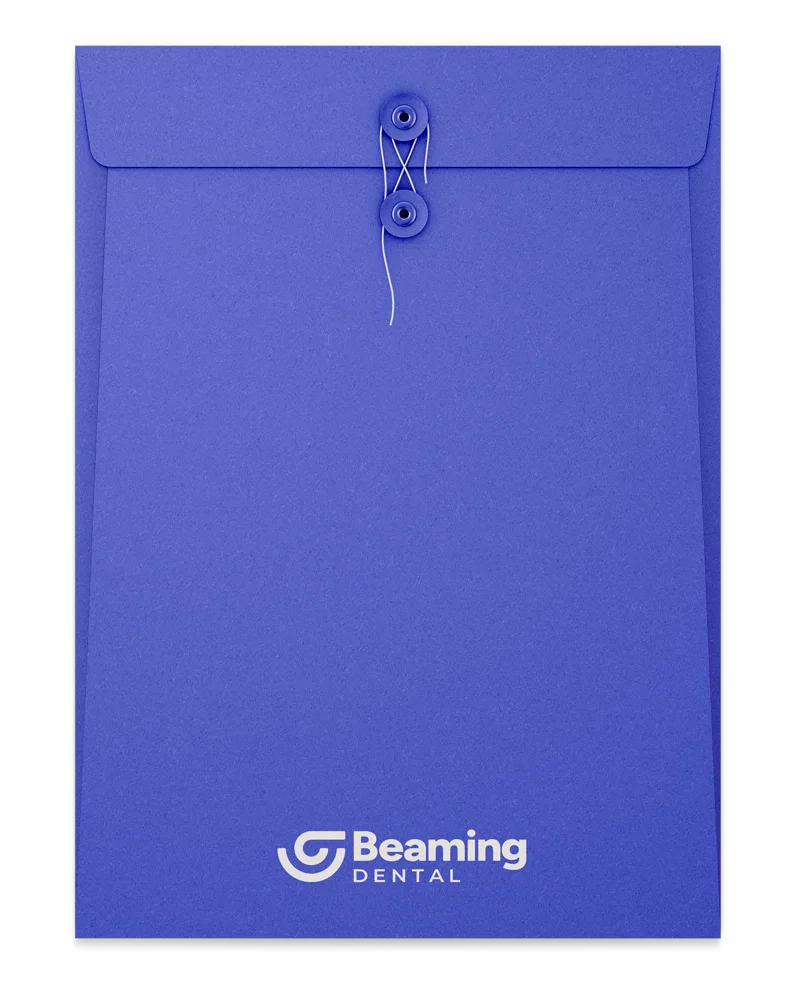
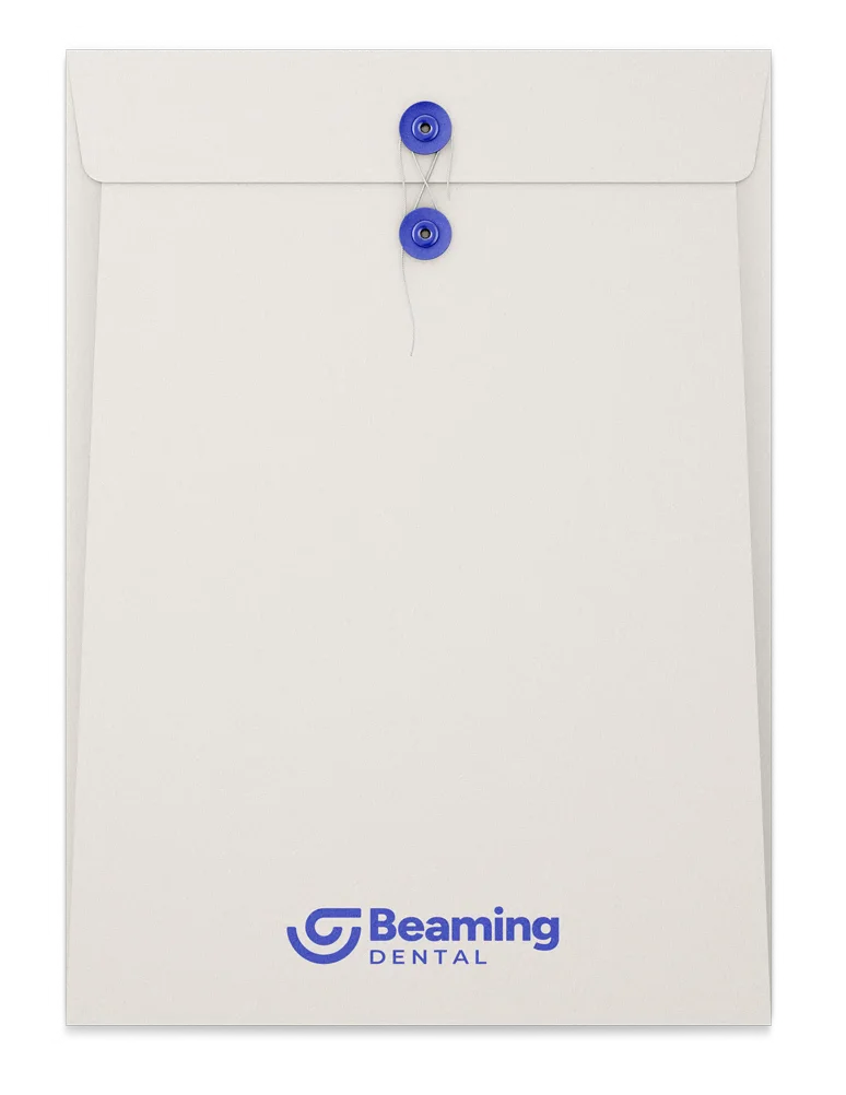
Envelopes